Brighthouse Financial Advisor Site
Role: Design Direction
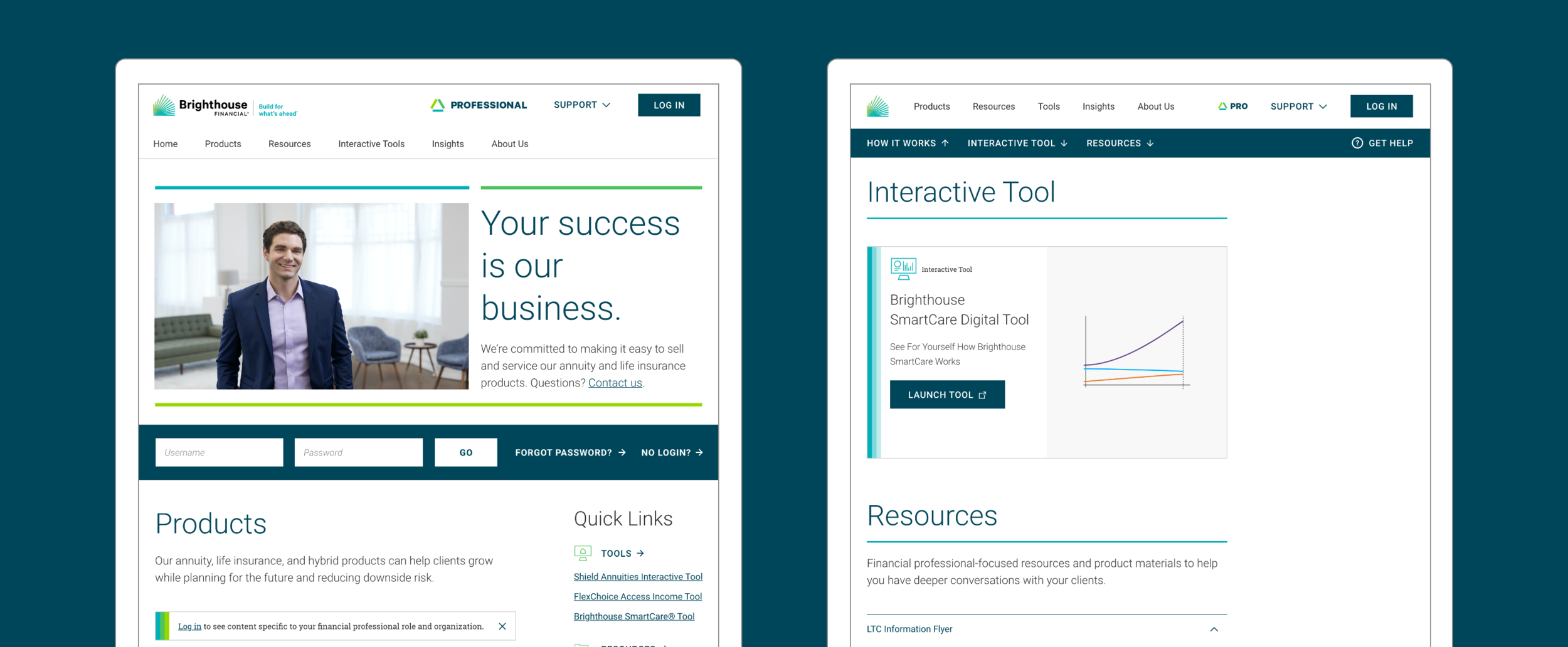
After we built the consumer-facing site for Brighthouse Financial, the client used those same page templates and assets to create their advisor-facing site. But with very little overlap between the needs of those two audiences, financial advisors were experiencing quite a bit of friction — struggling to find information and perform basic tasks using what was essentially a marketing site.
Brighthouse asked us to rethink the advisor experience and create a new site that supports how advisors actually work. With a visual approach derived from a new advisor brand, the result is a clean and functional experience that organizes content to meet their needs. Photography is dialed back, graphic treatments are more delicate, and color is more restrained, clearing the way for getting things done.
Work currently in progress, please do not share.
Research & Discovery
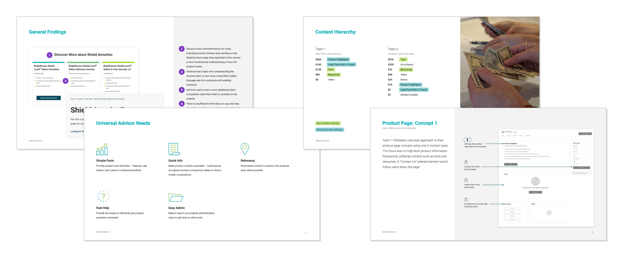
We started our process with a review of current site analytics and overall site organization. Combined with usability testing for top advisor tasks, we arrived at a set of universal needs that would form the foundation of our design approach. Ideation workshops with our client team helped us reveal critical overlaps between advisor and business needs.
Concepting
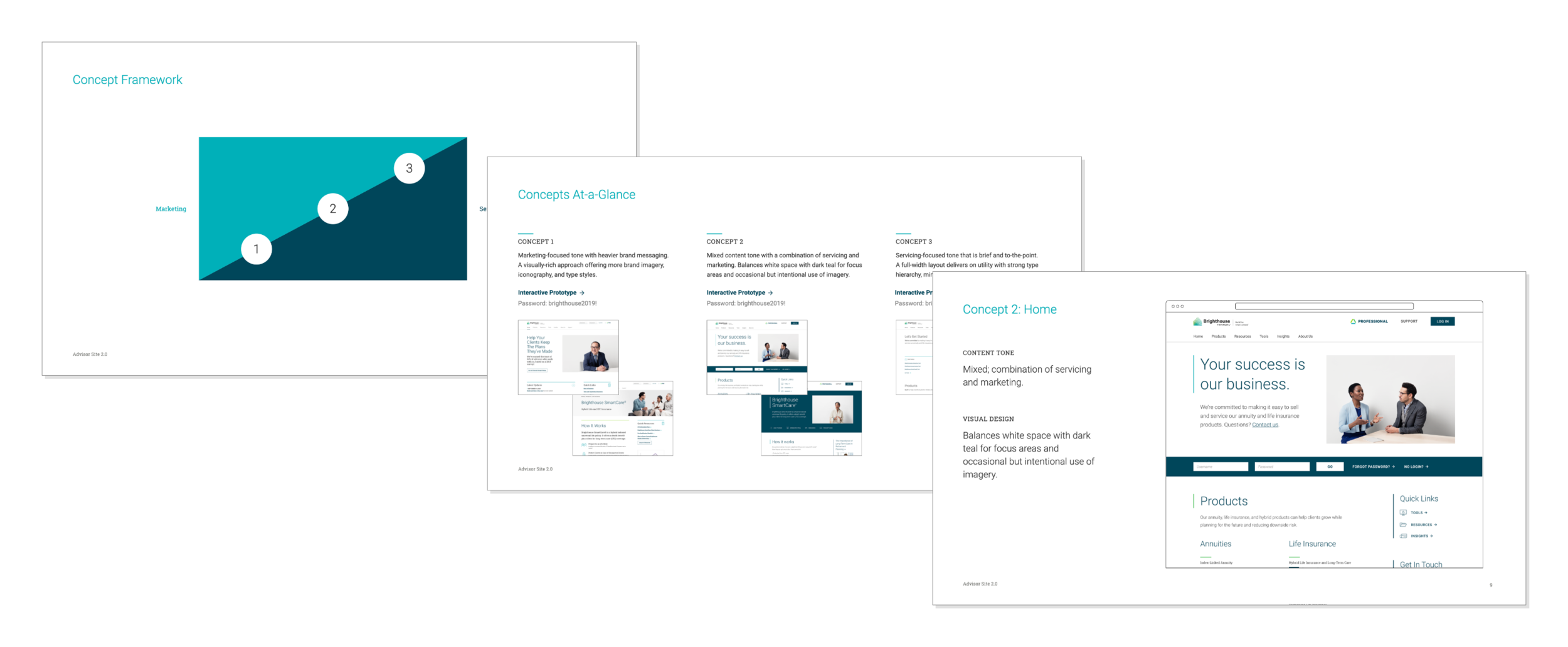
A concept framework helped to position our approach which varied in both visual design and content tone. We explored three different directions along a spectrum between pre-sale and servicing behaviors.
Design & Build
With alignment on a concept direction we moved forward to design and build a robust set of templates that would accommodate most page types.
Component Creation
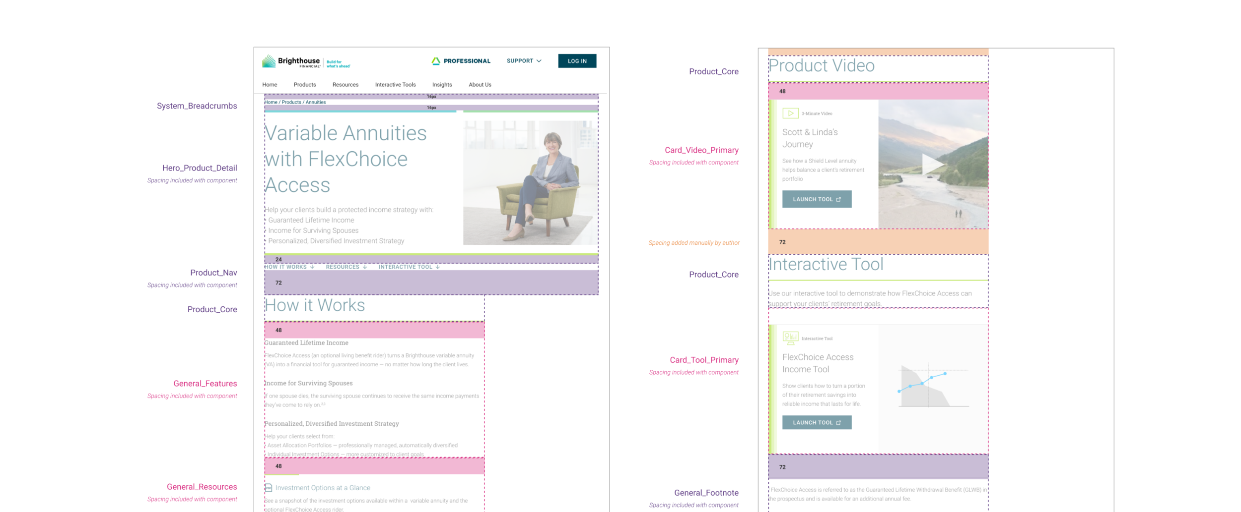
Page designs were then translated into a system of components to be developed for the client’s CMS, Adobe Experience Manager. At this stage our user focus shifted from advisors to content authors, finding that balance between enough flexibility to build pages not yet imagined but also providing guardrails to keep new content aligned with the rest.
Essentially a system on top of a system, these CMS components were more rigidly-defined elements with a specific intent, such as a banner advertising a new product or a card detailing a financial tool. These CMS components had parent/child relationships and included spacing that allowed content authors to drag & drop to create new pages. Behind the scenes, these CMS components were comprised of design system elements built with an atomic approach.
Outcomes
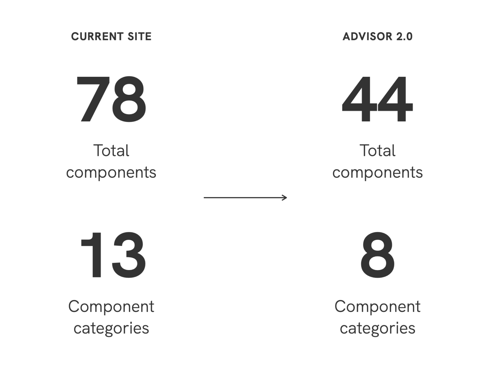
The advisor site is still under development so we don’t yet have metrics that we might compare to our initial testing for top tasks. That said, from a systems perspective, we were successful in building out a more robust set of CMS components that did a lot more with less. The system was leaner, more functional, and easier to use for content authors.