Craft Design System
Role: Staff Product Designer, Design Systems
Provi is a B2B alcohol marketplace that connects buyers, distributors, and suppliers in a single platform. I joined Provi specifically to partner with an engineer to plan, launch, and manage a new design system, named Craft, that would speed up product growth and improve UX consistency.
Work currently in progress, please do not share.
Goals
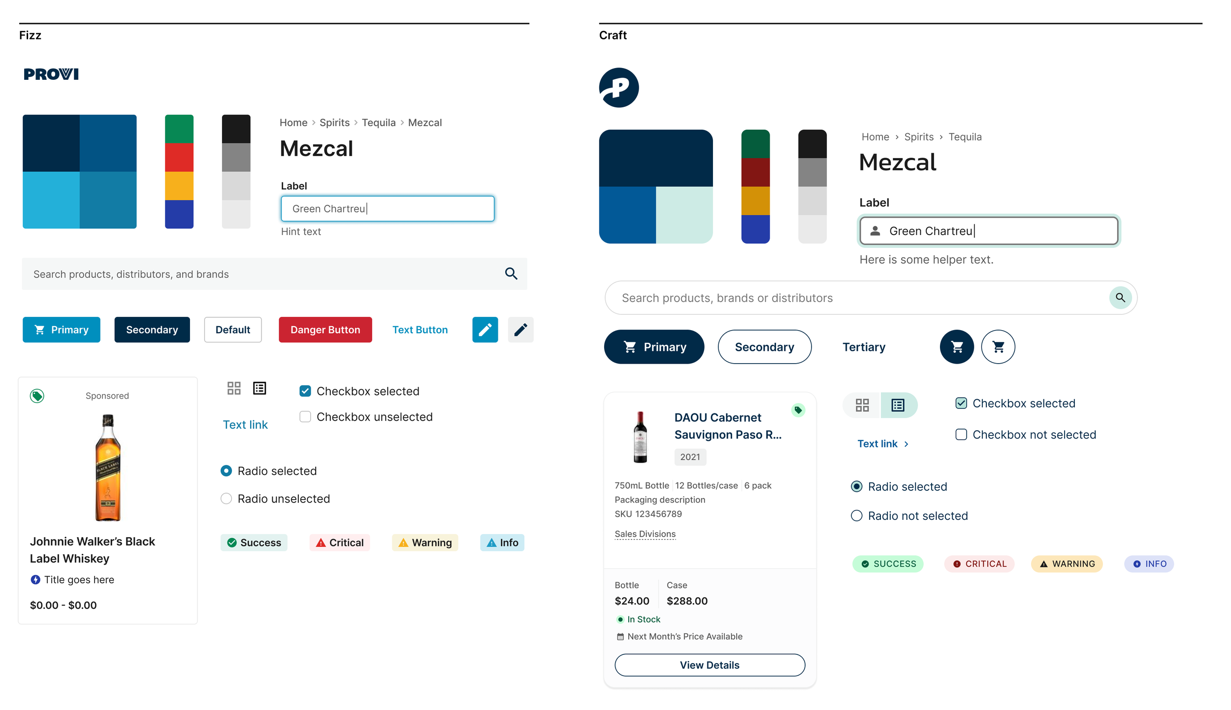
The existing design system, Fizz, was put in place without standards that would help it scale meaningfully. Naming conventions and tokens weren’t well-defined and contributions over time were ad-hoc. Without guardrails in place the system became bloated with a sizeable gap between design and code.
Stronger Foundation
Our primary goal with Craft was a more robust foundation that would provide us with better flexibility down the road. That meant setting up clear standards, simple rules around contributions, and strong documentation. On top of all that we’d be enabled to build a library of components with high reusability and low specificity.
Visual Clarity
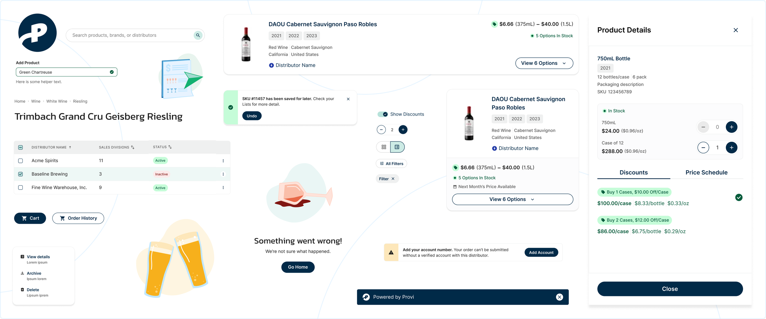
Clarity and efficiency were two key themes in building out the new system. We wanted a UI with better spacing, intentional use of fewer colors, and stronger type hierarchy. Our users are browsing many different product variations and evaluating multiple pieces of information at a time — price, price per ounce, vintage, case size, etc. — often while standing in a stock room with their laptop. A clear, scannable interface was a critical outcome.
Enforcing Consistency
The interface suffered from inconsistencies that made for a disjointed user experience especially in how we communicated with users. Dialogs were used both for task completion and for important announcements. Alerts were overused. A global banner had been in place for months. We shifted many tasks to a drawer overlay that kept users on the page, and I created standards around messaging so that we’re communicating to our users with the right level of intrusiveness at the right time.
Foundations
Naming Conventions
Following an audit of the current styles, we set out to more rigorously define the foundations of the new system. This included everything from interactive state names to icon naming conventions. We also classified our styles across the board, including corner radii, type, shadows, and color values.
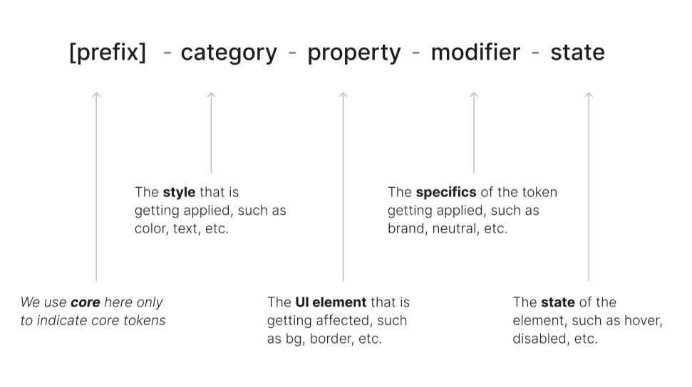
Token Syntax
Where possible we encapsulated style decisions as tokens for better scalability. We started with a simple naming structure that would work across both core and contextual tokens. Corresponding variables on the Figma side were scoped so that designers would only see the appropriate variable based on the element.
Accessibility
Ensuring the best possible experience for all users was one of our core principles in building Craft. Decisions included:
Color palettes with strong contrast, and never using color alone as an indicator of status or state
Calls-to-action and links should clearly state the result or destination via interaction
Icon names describe the icon and not what it represents
Using clean, semantic HTML to support screen readers and other assistive technologies
Considering keyboard controls for certain components, such as ESC to close a dialog, and relying on focus:visible for keyboard navigation
How We Launched
Part 1: Component Planning
I prioritized components based on need, with the global header MVP driving an initial batch of workhorse components — links, buttons, input, icon, etc. Other component types were grouped by category and given estimates to design, develop, and document them before going live. This schedule helped get buy-in from other teams on our plans before moving the work into Jira for full tracking and visibility.
Part 2: MVP
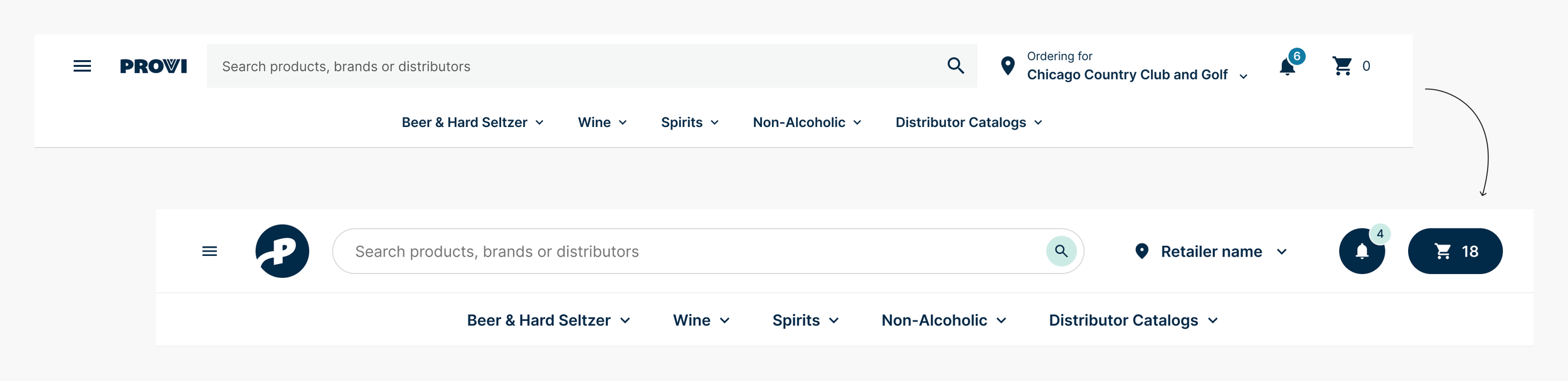
We decided on building out the global header with new components as a way to both soft-launch the system into the experience as well as learn from engineering teams to gather feedback. The effort was to replicate existing functionality without meaningfully reorganizing the navigation. We tracked usage metrics from a do-no-harm perspective to check that usability was as good or better than the previous iteration, which we confirmed.
Internally, feedback was insightful. Our system organization and documentation was strong, but despite our best efforts, we built a few elements with too much specificity. We had to remind ourselves to think more atomically even when trying to match the functionality of an existing experience.
Part 3: New Product Launch
The next phase for Craft would be to use it to build out a new white-labeled marketplace offering called Storefronts. Part CMS and part marketplace, distributors could spin up their own branded site showcasing just their catalog of products. Pricing, inventory, and purchasing would be all powered by Provi.
As a new product built in a fresh environment with a tight deadline, Storefronts was an ideal candidate to utilize Craft for the full buildout. Four designers and multiple engineers across three teams were able to build a new marketplace experience — product listing page, product detail pages, and cart — in about two months time.
Education & Transparency
Understanding a design system and the value it brings is critical to adoption. I ran multiple sessions with designers, engineers, and product managers to evangelize Craft and build trust with teams that my efforts would support and improve their process.