Sendoso Design System
Role: Lead Product Designer
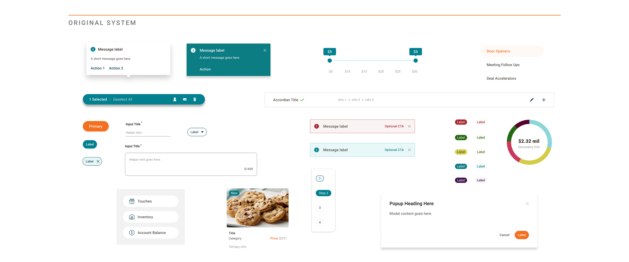
I joined Sendoso just as they were beginning the first major overhaul to their product, with a new design system needed to serve as the foundation of that effort. Their existing system was high on specificity and low on process, with numerous components that had been built quickly to address specific needs. The result was a cumbersome set of assets lacking in flexibility.
From a new visual style to hands-on component design to process overhaul, I led the design effort to launch and maintain Sendoso’s new design system, Willow.
Visual Exploration
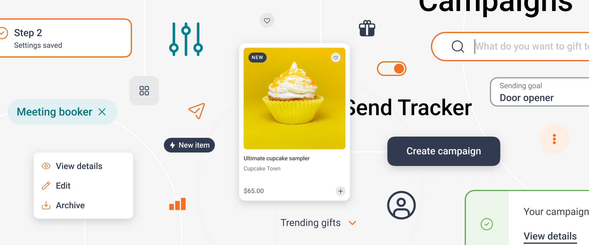
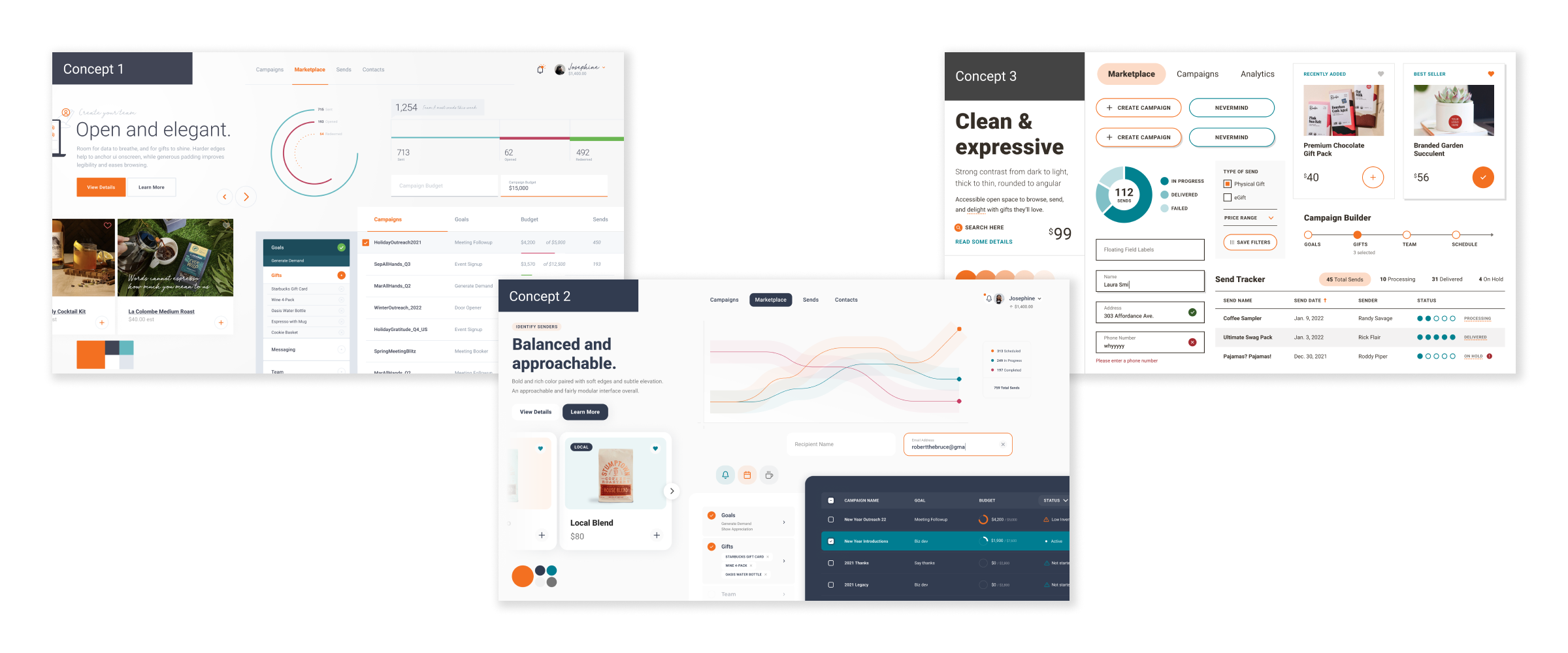
I worked with the brand team and design partners to establish a set of principles and key UI elements in order to build out a set of one-to-one visual style concepts, or style tiles, to determine the look & feel of our system. We voted across design, product, and engineering teams to establish which concept should lead but also which aspects of other concepts should be included. The end result would guide the direction of design systems work moving forward.
Foundational Styles & Initial Components
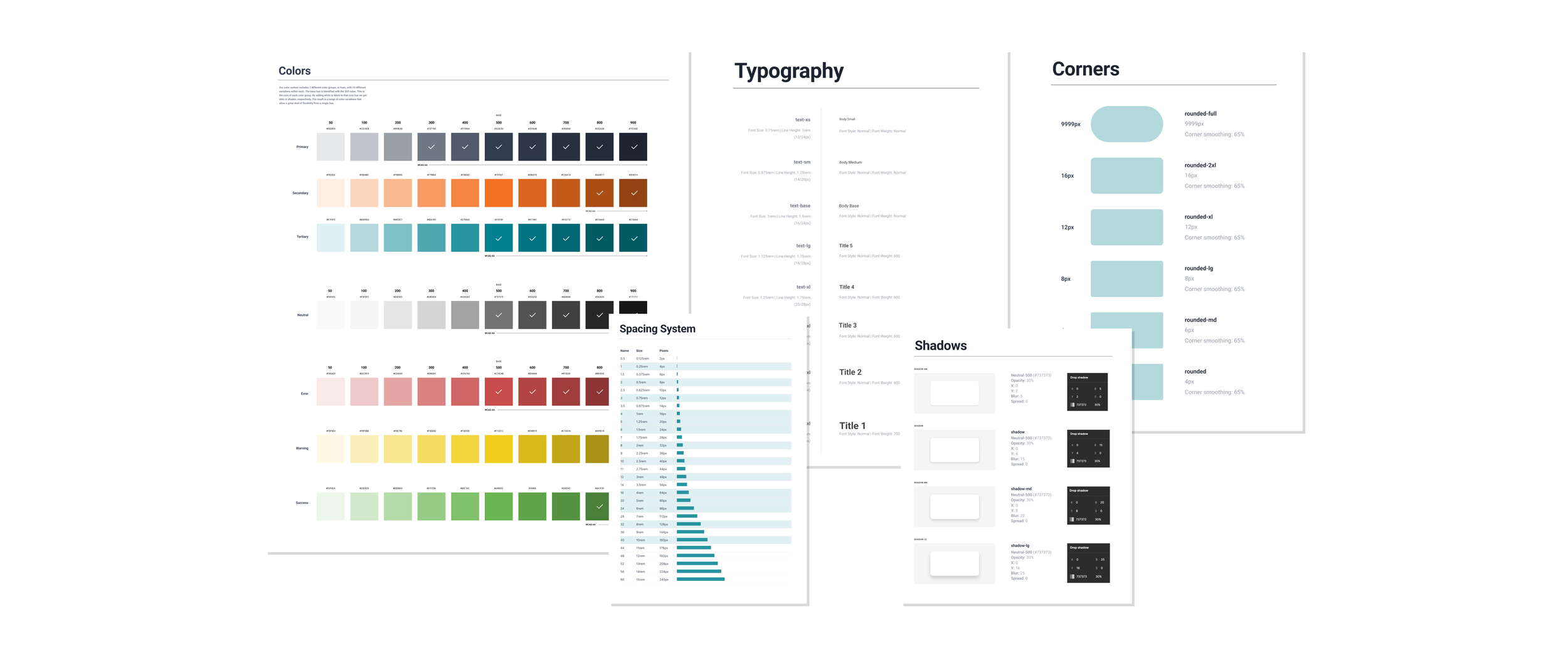
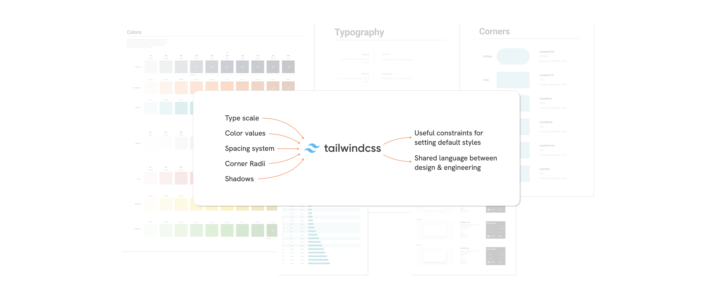
We used Tailwind CSS to help us establish the styles that would serve as the foundation of the system — color scales, typography, corner radii, etc. Tailwind’s utility classes provided us with guardrails for decision-making at this crucial stage of the process. Instead of spinning on how many type styles or drop-shadow variations we might need, we were able to use (or update) existing defaults that provided more than enough flexibility.
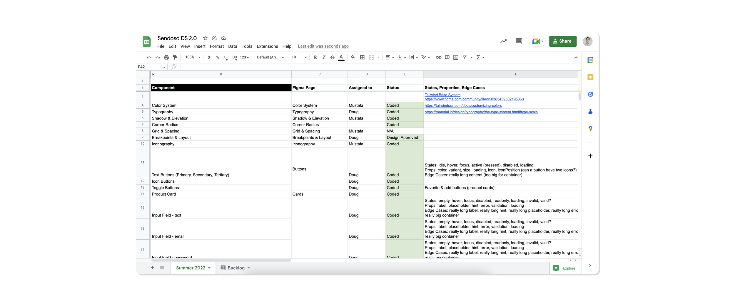
With the foundation set, we audited the existing product to create a quick & dirty list of standard, must-have elements we’d need to build out in order to get teams moving quickly. We prioritized each element along with the required states, properties, and edge cases we’d need to consider.
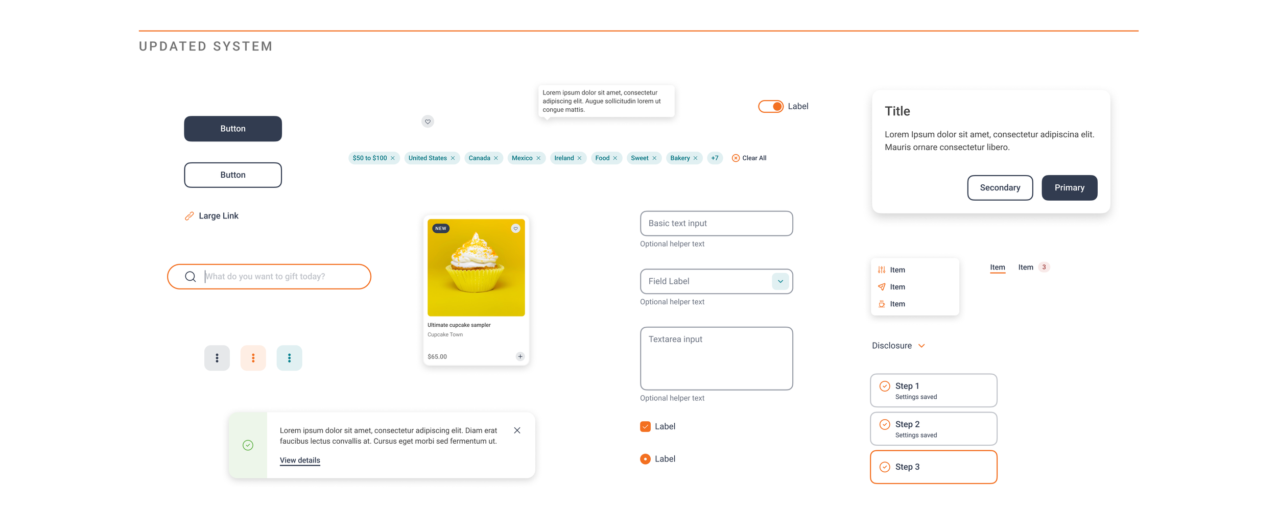
A Fresh System
The result was a new set of assets that met basic needs across teams, but with a softer and more sophisticated UI that felt more appropriate for a maturing B2B product. Styles were more consistent from component to component and far more accessible in terms of color usage and type sizes. And the atomic approach to the system allowed the flexibility to spin up new components as compositions of pre-defined atoms and molecules.
Refining the Process
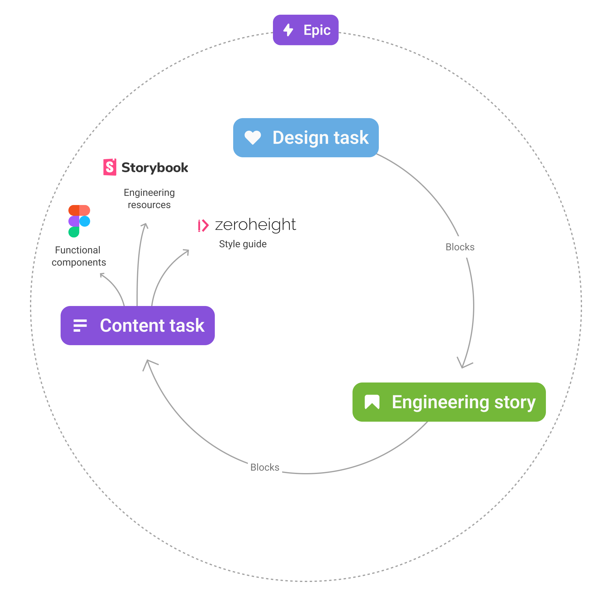
With foundational styles and initial components underway, I took the opportunity to give more structure to our process to ensure as much transparency and accountability as possible. Engineers and PMs across teams needed to know where a new or updated component was in our workflow.
To that end, each sprint began with a discovery phase that included an opportunity to collaborate on component needs and priorities. In Jira, we broke up component development into design, build, and publish task types that made it clear what phase the work was in. We also worked to make sure there was plenty of cross-linking between design system tasks on our board and stories on individual team’s boards.
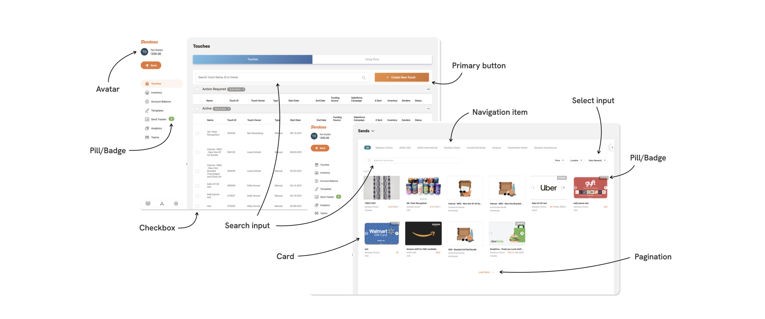
Figma Organization
Designers and engineers are the primary users of our system but their needs aren’t always the same. We organized our Figma DS file around these needs.
A “specs” section housed all the rules, states, Tailwind specs, and prototypes for our engineering teams to learn from and build. Separately, a “components” section housed all of the functional Figma components, complete with all necessary variants and built-in interactions, that designers would need in their work.
Our Figma approach utilized “base components” to allow for simple changes across countless variants. For example, a button would have a “base” version that included all possible elements that might be included — a label, leading icon, trailing icon, etc. This base was component-ized first, and then the actual functional component with its variants was created from an instance of the base. With the base component nested inside the functional one, any change to the base — an updated corner radius, or change to a border width — would easily populate across dozens of variants.
Philosophy
Our team approached the work based on the well-established mental model of atomic design. This helped us to build with a hierarchical mindset that focused on rigidly-defined building blocks that would enable flexible arrangements of more complex components.
We also stressed the importance of constraints as an enabler of speed. By accepting the limitations of our system now we can build with that we have immediately. Using available components, or updating existing ones to meet a need, is always preferred over creating something new. This acceptance reduces blockers and gets designers building new screens and flows that will be closer to reality much more quickly.
Finally, we all recognized that product design requires an MVP mindset that doesn’t allow perfection to be an enemy of the good. In the same way, building new components can be iterative as well — complex components can be released in phases that meet basic needs first, and nice-to-haves later.
Engineering leadership from Joel Saupe and design support from Ryan Stephen.